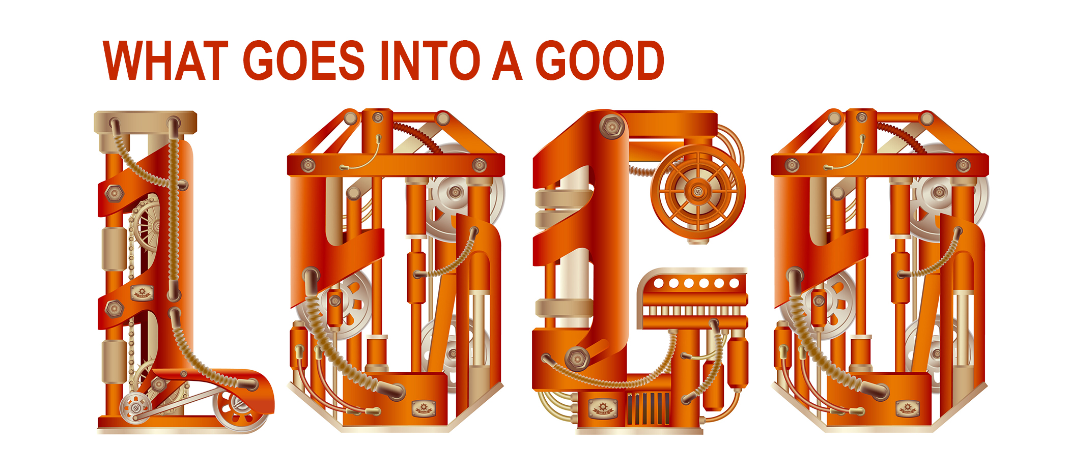
The Mark of a Good Mark
by Tom Kegley
Your logo might be the most powerful tool in your marketing kit. Not to be confused with your brand– the sum of your reputation and your customer’s experience with and perception of you. Your logo is the mark of your brand– the salutation and closing signature of all your graphic communication.
A good logo is your graphic representative. It conveys your identity, value, product, and service. It’s common for a company to have its logo in the back of its mind. Now and then, it’s a useful exercise to move that logo to the front of the mind. Take stock to make sure it speaks well for you and functions graphically. Something that shows up in nearly every marketing message you generate deserves some attention occasionally. Right?
Take a look at your logo. Maybe it’s perfect. I won’t be surprised if it occurs to some that a change is due. If so, I share some basics from my experience with logos that might help if you need to create or update.
Logos are Varied
Logos come in various formats, shapes, colors, and moods. The creation is a mix of inspiration and purpose. The goal is to find the right fit for you. Basic presentations would be-
The Logo Construct
Break it into three parts from the design perspective. Often, I’ll try to incorporate a fourth element, less from the design side and more to the message side.
File Function and Flexibility Across Print/Digital Mediums
I’m getting a bit technical here with one of the challenges I have in working with a company’s logo. The issue is dealing with improperly formatted files for the given need. Print and digital mediums call for different file formats to get the best reproduction. A few things to know-
.eps- vector-based for print uses, scalable
.jpg- raster-based for print and web uses, not scalable
.svg- vector-based for web uses, scalable
.png- raster-based for web uses, not scalable, very useful as the background can be transparent
.pdf- a lot of these floating around but use with a grain of salt. Some are vector and some are raster depending on how they are generated. If you understand that, they do have print and web applications.
If you don’t have a version of your logo in Illustrator, get a graphic design person to take the time to recreate it. As a famous brand says- Just Do It.
When to Create a Logo
Hopefully, your logo is serving you well. That said, there is a time and place for everything. Some instances for logo work-
- A Change in the Company- could be new ownership or management, a significant change in business direction, an evolution over time that needs to be highlighted.
- Refresh- moving on with the times. The update might keep some aspects of the prior logo- color, font, icon- or go in a completely new direction.
- Last, but not least… if it’s just plain bad or you haven’t thought about it in 25 years.
A note on the last three points- you’ll need to give some thought to the introduction of the logo. Let folks know what you’ve done and why. Don’t be overly concerned with switching from one logo to the next in terms of printed inventory. It’s OK to use up what you have on hand and transition over time.
Development
The main thing here is to work with an experienced and competent designer. Shy away from the friend of a friend who knows of a nephew who has a cousin that likes to dabble in art. A graphic designer will be invaluable in listening to and understanding your need and articulating your vision and mission. This should be a process that starts a bit fuzzy with concept and step by step comes into focus to completion and involves a good back and forth dialogue.
Now there are online sources that develop logos for not much cost. Of course, I’m biased. I do believe the personal touch gets a qualitatively better result.
The last point- make sure the work is truly original or free and clear if you utilize stock rental resources. Don’t fish in waters that might cause issues with copyrights and trademarks. I’ve seen it happen.
Value
What’s a logo worth? A lot. Day in and day out, it’s your ambassador. It’s the one representation you attach to every visual marketing message you output. It needs to look good, reproduce well, and reflect your brand.
If you’re considering creating or updating a logo, keep in mind that it’s not a widget pulled off a shelf and put into use. It’s a one-of-a-kind creation that takes some work. And you need to like it when it’s finished.
As far as price goes, that depends on the designer and you. There’s no Kelley Blue Book version for logos. The logo estimates I give are historical. I know how I work and think but I don’t know how others work and think. That’s where the listening and understanding I mentioned earlier comes in. An important aspect of the process.
Whatever you pay for your logo, think of it in amortization terms. What if you use it for 5, 10, or 20 years (with some updates along the way for the older end of the spectrum!)? Cost seems not so daunting.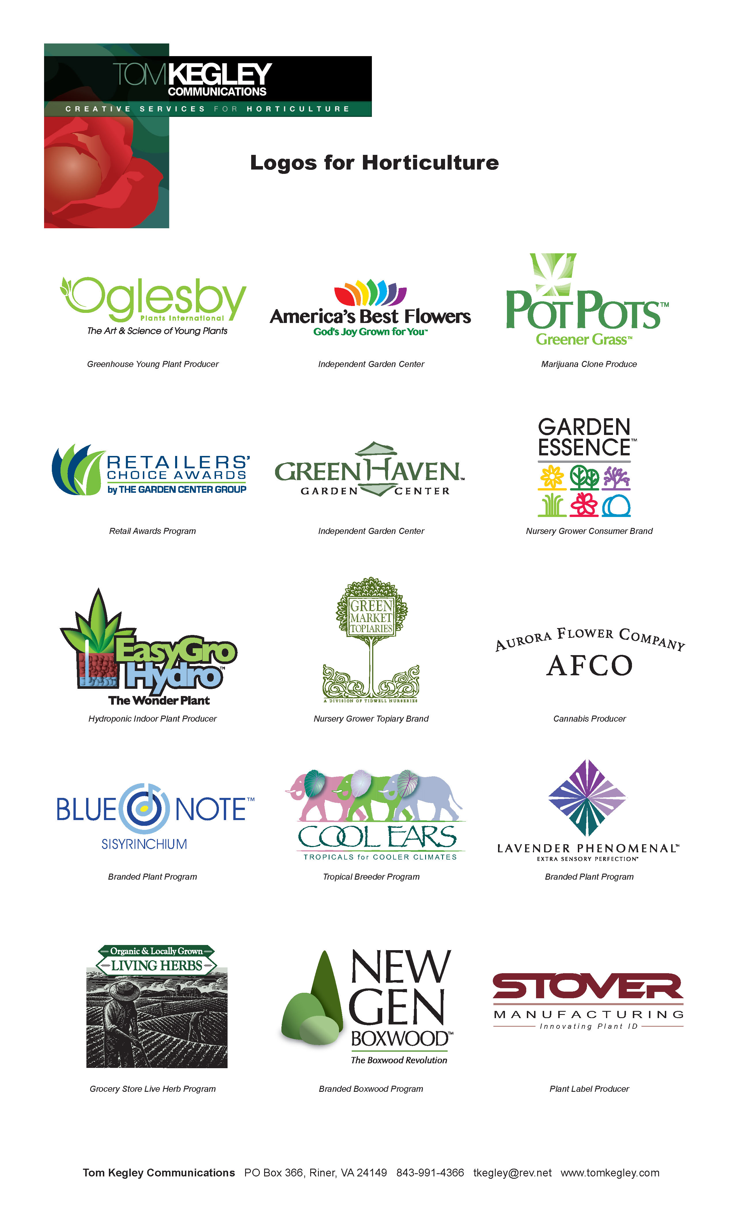
A Group Challenge
An idea occurred as I wrote- a fun and revealing exercise would be for each of you to send me a copy of your logo (.jpg fine). I’ll compile them into an album to share back with you. I bet we’ll see a compilation across the spectrum of personality and character just like the independent garden centers you are! Not a contest, just a gathering. Reach me at [email protected] if you’re inclined.
Meantime, I am sharing my library of logos from over the years HERE (or image on right) for PDF. As I said, all formats, shapes, colors, and moods.
Have a terrific Spring!


Tom is The Group's "Branding Guru." Tom Kegley Communications provides marketing communications services to all segments of the horticulture industry and is a Service Provider to The Garden Center Group.